Work compels me to look at a lot of charts of stuff changing over time. The workflow is good for the purpose - an R script gets the data from a database, does a bunch of stuff, and outputs a bunch of image files of ggplot charts.
Of course ggplot is great and it works really well for most of my work-charting needs. But, like any tool, there are some frustrations. Today the struggle is figuring out how to label a date axis in a way that’s comprehensible but compact.
I tried a bunch of options; built-in-formatting, a custom date formatter, annotations… Some things worked better than others.
Because I can’t share the real data I use, I downloaded some historical data on temperatures in Oshawa from the Canadian Government’s climate data archive at: http://climate.weather.gc.ca/historical_data/search_historic_data_e.html
This data isn’t all that interesting, and it has some missing values, etc. But for this purpose I want something easy to work with and simple. So hey, good enough, right? It has monthly values across multiple years, and some of those values are higher than others. What more could you want?
If you are as worried about formatting date axes as I am, you probably have data of your own to use. If you don’t, here’s your chance to learn about the monthly average tempatures in Oshawa, Ontario.
The data has columns for the first of the month, the month number, the year number, and the mean monthly temperature (Celsius).
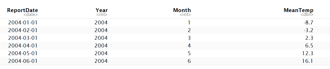
After making sure the report month is formatted as a date, I’ll plot the default….
ggplot(oshawa, aes(x=ReportDate, y=MeanTemp)) +
  geom_line(colour = "#3E4E68") +
  geom_line(stat="smooth", method="loess", colour = "red", alpha = 0.4) +
  labs(title = "Mean Monthly Temperature In Oshawa",
       y = "Temp (Celsius)",
       x = "Measure Date")
Not so good. It’s easy to tell where January is, and July… The summer looks a lot warmer than the winter. If I had a really long series and only cared about a trend, this might work, I guess.
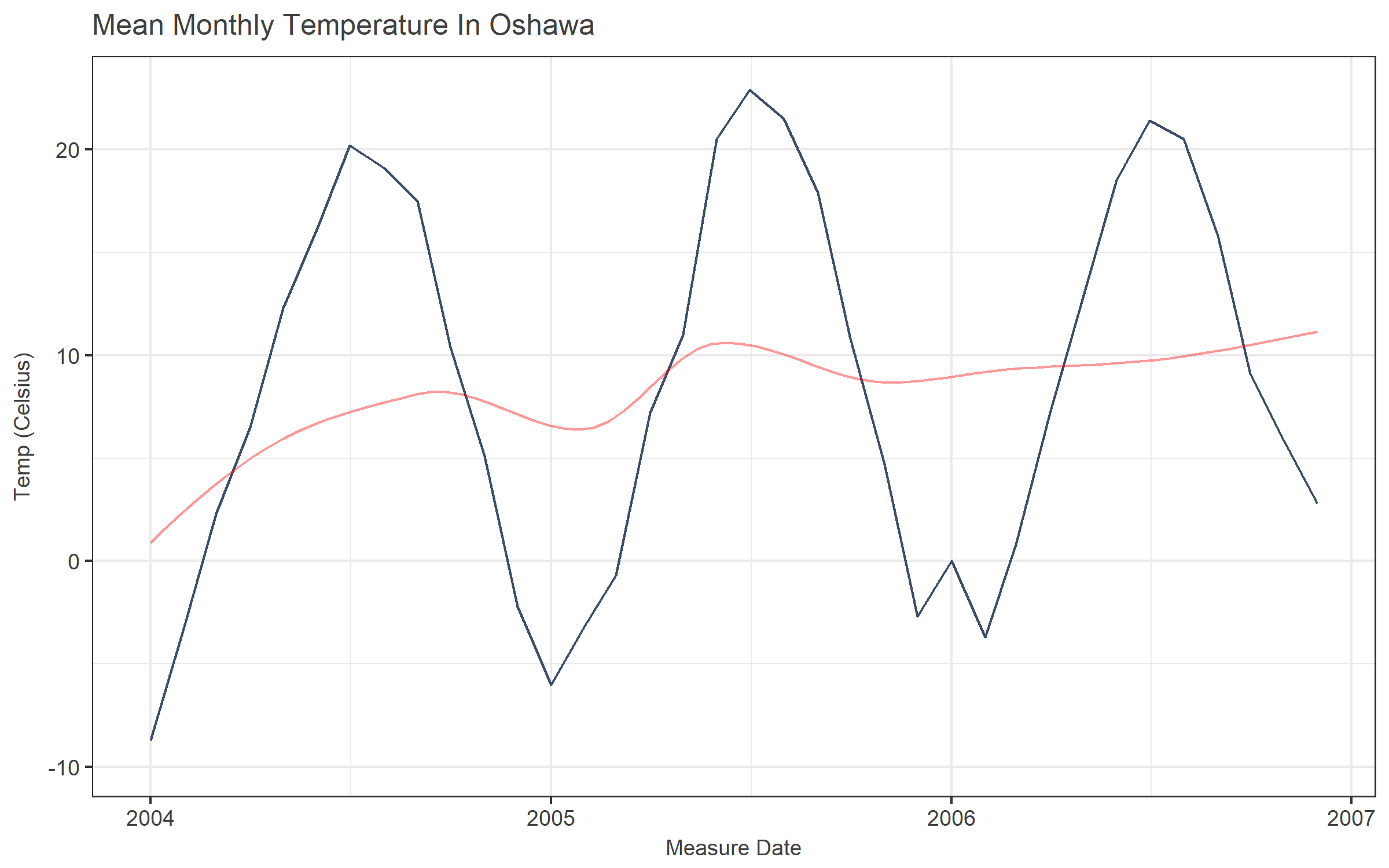
Of course, we can easily change the x-axis to include date breaks for each month, or every 3 months, or whatever we like. (I also put the “expand = c(0,0)” in here because I don’t like having labels on the x-axis with no data.)
ggplot(oshawa, aes(x=ReportDate, y=MeanTemp)) +
  geom_line(colour = "#3E4E68") +
  geom_line(stat="smooth", method="loess", colour = "red", alpha = 0.4) +
  labs(title = "Mean Monthly Temperature In Oshawa",
       y = "Temp (Celsius)",
       x = "Measure Date") +
  scale_x_date(date_breaks = "1 month", expand = c(0,0))
Well, that’s somewhat less than helpful. Maybe rotating the labels would help?
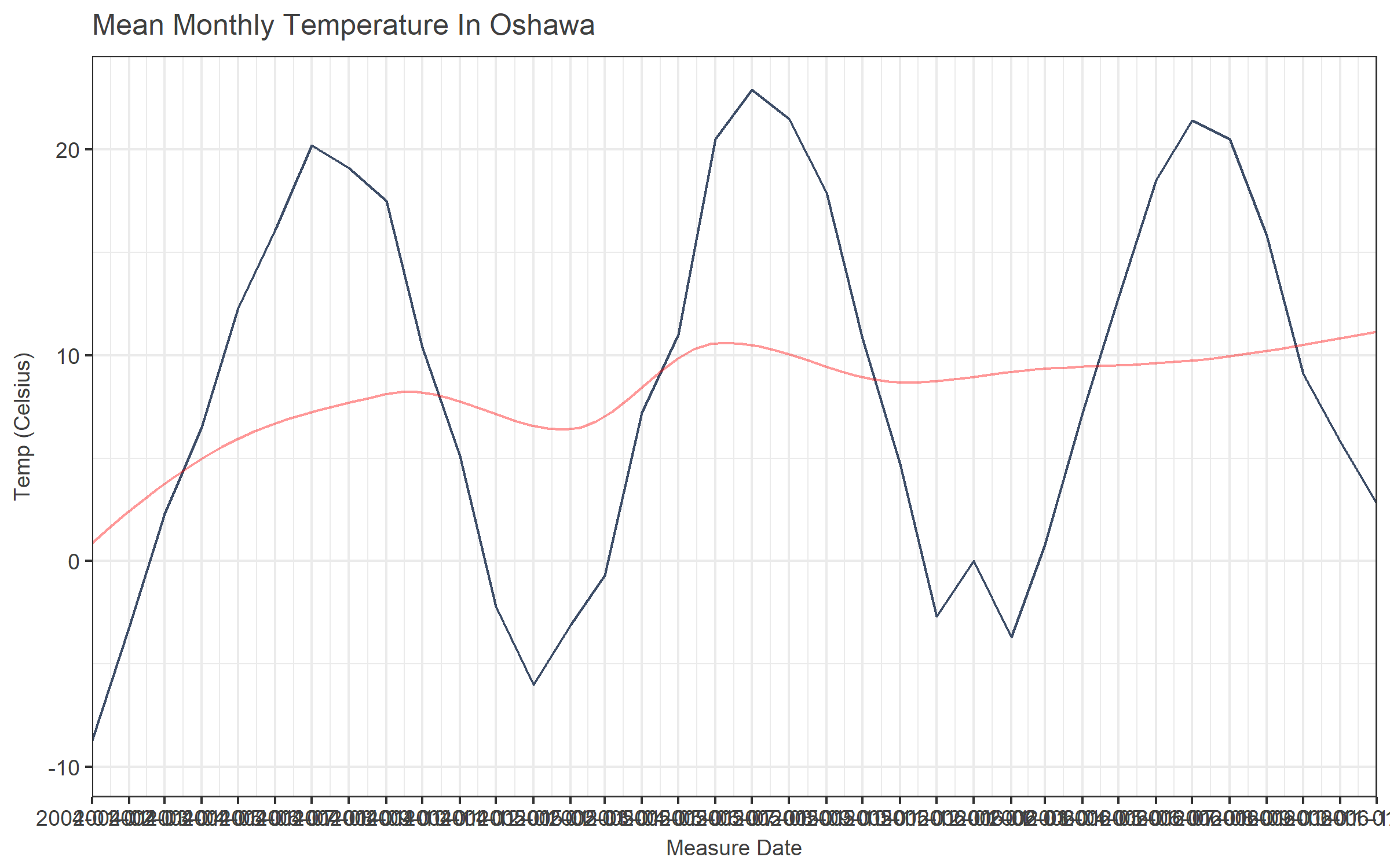
ggplot(oshawa, aes(x=ReportDate, y=MeanTemp)) +
  geom_line(colour = "#3E4E68") +
  geom_line(stat="smooth", method="loess", colour = "red", alpha = 0.4) +
  labs(title = "Mean Monthly Temperature In Oshawa",
       y = "Temp (Celsius)",
       x = "Measure Date") +
    scale_x_date(date_breaks = "1 month", expand = c(0,0)) +
  theme(axis.text.x = element_text(angle=90, vjust=.5))
That’s better, but rotated axis labels are hard to read, especially when they are lengthy. Plus, they take up a lot of space that would be better occupied with the actual graph.
Also, because the axis displays a full date but represents a monthly average, there is information in the labels that’s useless at best and misleading at worst. (Were these the measurements taken on the first day of the month? The title and the axis don’t jive.)
So maybe we can try formatting the labels differently to just get month and year.
ggplot(oshawa, aes(x=ReportDate, y=MeanTemp)) +
  geom_line(colour = "#3E4E68") +
  geom_line(stat="smooth", method="loess", colour = "red", alpha = 0.4) +
  labs(title = "Mean Monthly Temperature In Oshawa",
       y = "Temp (Celsius)",
       x = "Measure Date (MY)") +
    scale_x_date(date_breaks = "1 month", date_labels = "%y%m", expand = c(0,0)) +
  theme(axis.text.x = element_text(angle=90, vjust=.5))
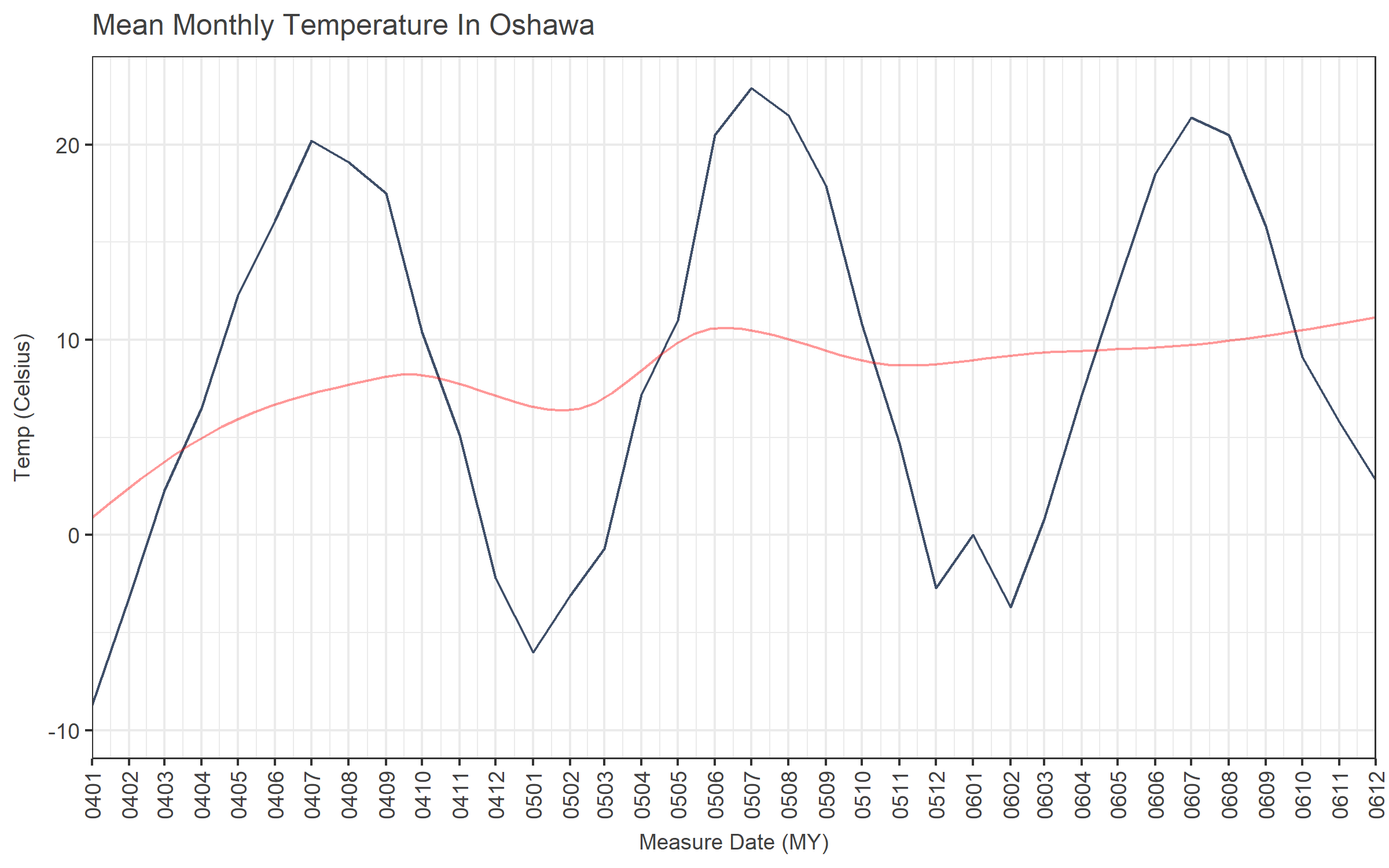
Ick.
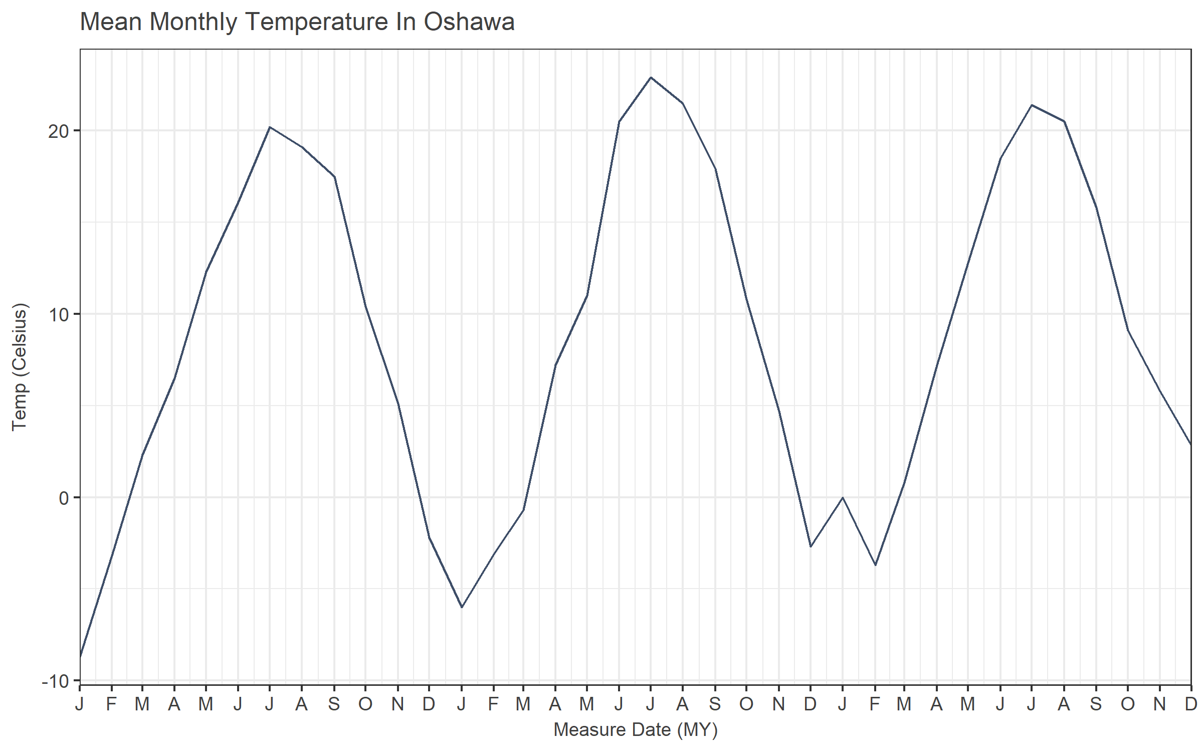
Text months are easier to understand than month numbers.
ggplot(oshawa, aes(x=ReportDate, y=MeanTemp)) +
  geom_line(colour = "#3E4E68") +
  geom_line(stat="smooth", method="loess", colour = "red", alpha = 0.4) +
  labs(title = "Mean Monthly Temperature In Oshawa",
       y = "Temp (Celsius)",
       x = "Measure Date (M-Y)") +
    scale_x_date(date_breaks = "1 month", date_labels = "%b-%y",expand = c(0,0)) +
  theme(axis.text.x = element_text(angle=90, vjust=.5))
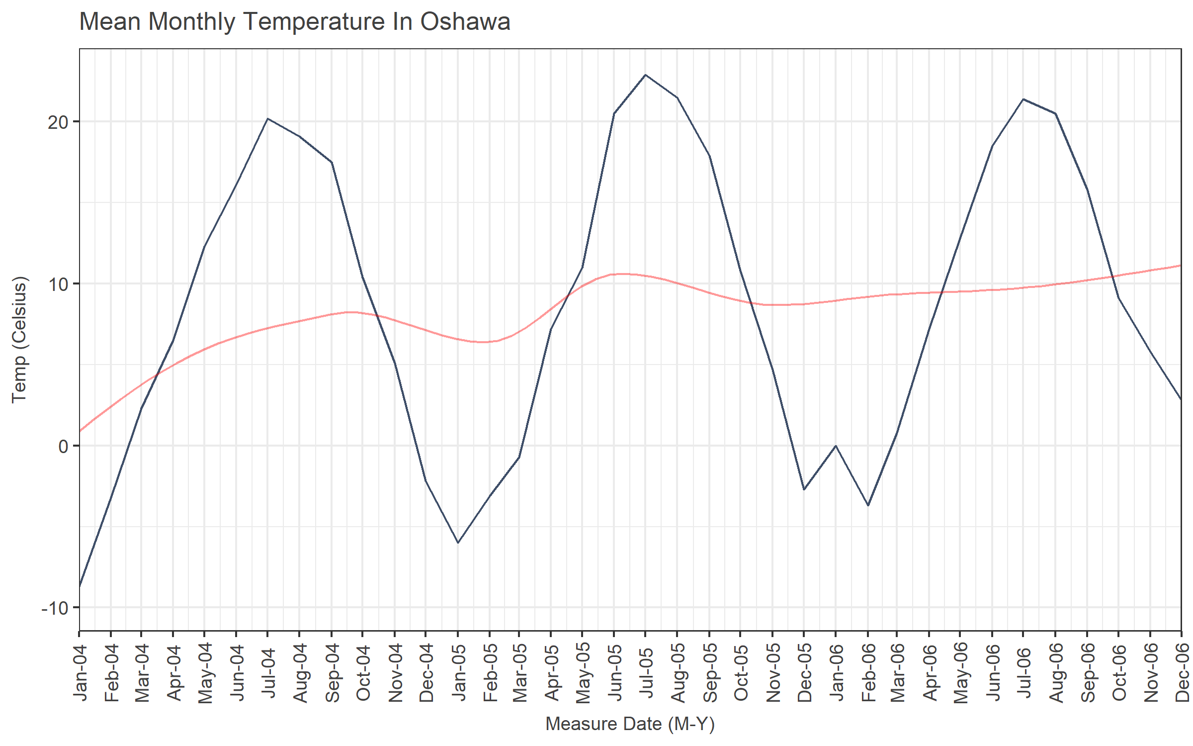
Not terrible. But not great. That’s about as compact as it gets while still being comprehensible with the standard date_labels %-style formats, as far as I can tell.
But - we can write a custom formatting function. This example will give you the first letter of the month and the two-digit year.
dte_formatter <- function(x) {
  #formatter for axis labels: J12, F12, M12, etc...
  mth <- substr(format(x, "%b"),1,1)
  yr <- format(x, "%y")
  paste0(mth, yr)
}
We’ll tell scale_x_date to use that instead… Note that the custom formatter function gets passed into scale_x_date via “labels” and not “date_labels”.
ggplot(oshawa, aes(x=ReportDate, y=MeanTemp)) +
  geom_line(colour = "#3E4E68") +
  #geom_line(stat="smooth", method="loess", colour = "red", alpha = 0.4) +
  labs(title = "Mean Monthly Temperature In Oshawa",
       y = "Temp (Celsius)",
       x = "Measure Date (MY)") +
  scale_x_date(date_breaks = "1 months", labels = dte_formatter, expand = c(0,0)) +
    theme(axis.text.x = element_text(angle=90, vjust=.5))
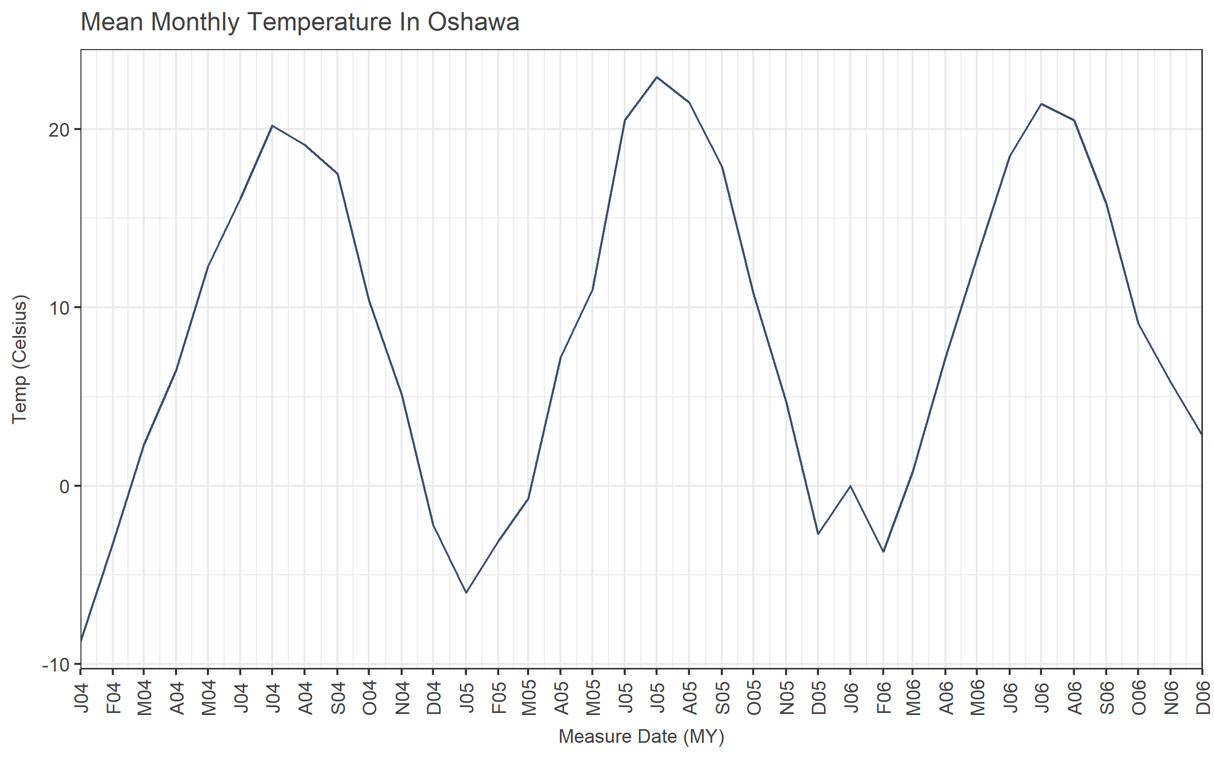
Better. Not amazing, but better.
Now what happens if we don’t want to rotate the labels? (I really don’t like rotated labels.)
ggplot(oshawa, aes(x=ReportDate, y=MeanTemp)) +
  geom_line(colour = "#3E4E68") +
  #geom_line(stat="smooth", method="loess", colour = "red", alpha = 0.4) +
  labs(title = "Mean Monthly Temperature In Oshawa",
       y = "Temp (Celsius)",
       x = "Measure Date (MY)") +
  scale_x_date(date_breaks = "1 months", labels = dte_formatter, expand=c(0,0))
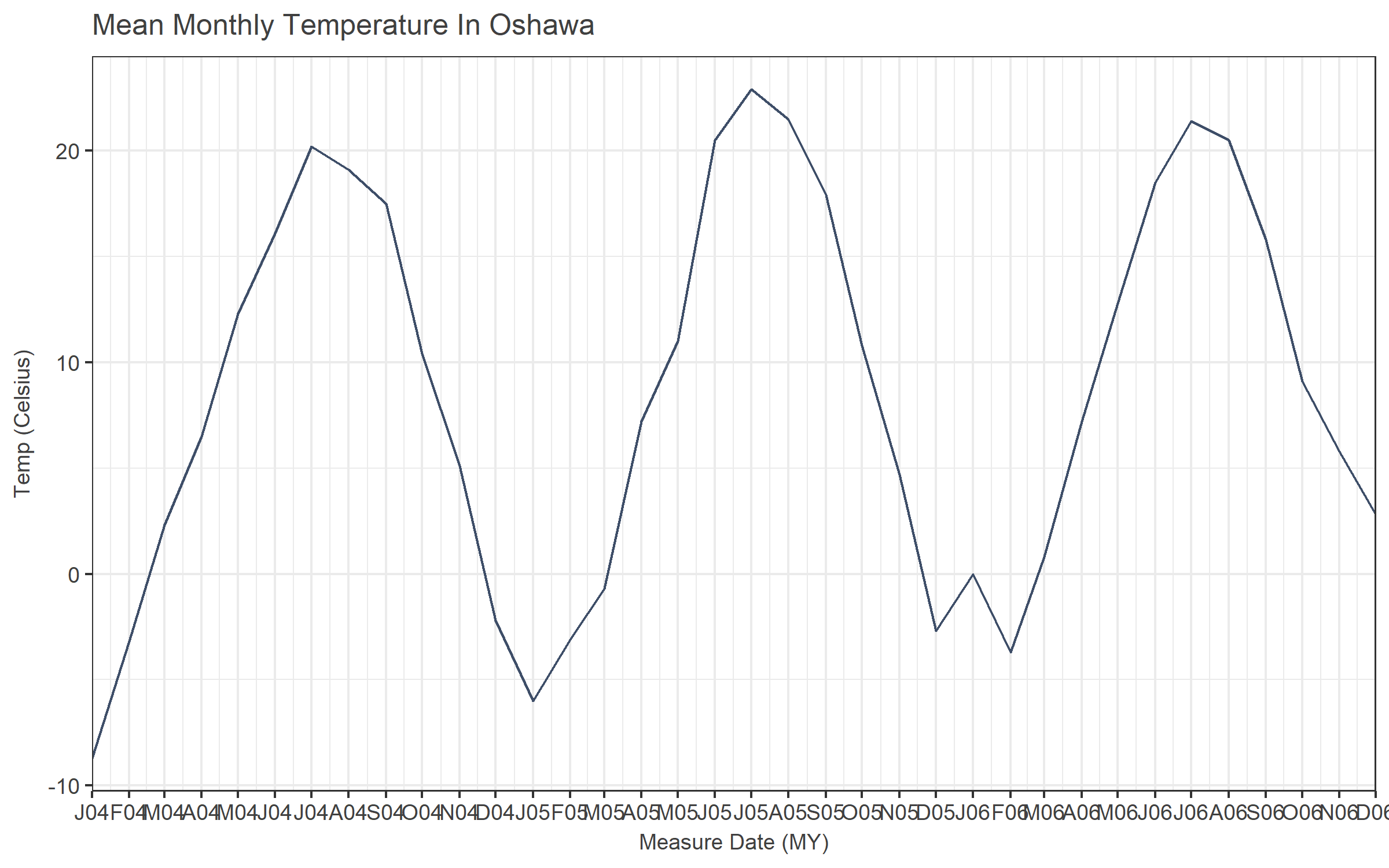
Ugh. From here, there are a couple options.
- Only label every x months
- Make your x-axis font size teeny
- Plot a smaller range of dates
Labelling the axis every six months doesn’t work so well (J12, J12, J13, J13, J14, J14). Every three months (J12, A12, J12, O12) kind of works, but not really. Every second month is maybe OK, but then your axis still gets crowded.
Realistically, this format probably only works well when your date_breaks are set to “1 month” so the pattern (JFMAMJJASOND) is intuitive. Which means that if you have more than a couple of years of data, this is a poor choice. Unless you have a really wide chart, I guess
Another solution would be to remove the redundant info from the labels. We don’t need to repeat the year at every tick mark. So we can just change our dte_formatter to only return the month part of the label.
dte_formatter <- function(x) {
  #formatter for axis labels: J12, F12, M12, etc...
  mth <- substr(format(x, "%b"),1,1)
  mth
}
ggplot(oshawa, aes(x=ReportDate, y=MeanTemp)) +
  geom_line(colour = "#3E4E68") +
  #geom_line(stat="smooth", method="loess", colour = "red", alpha = 0.4) +
  labs(title = "Mean Monthly Temperature In Oshawa",
       y = "Temp (Celsius)",
       x = "Measure Date (MY)") +
  scale_x_date(date_breaks = "1 months", labels = dte_formatter, expand = c(0,0))
Looks good, except now we have no idea what year each point belongs to. That tends to be an important detail. Excel, Tableau, etc. make this easy - the x-axis can be a couple of lines - months on top, grouped by the year displayed underneath.
In ggplot, you can do it too, but it takes some work and can get pretty complicated depending on the method.
You can approximate it using facets.
ggplot(oshawa, aes(x=ReportDate, y=MeanTemp)) +
  geom_line(colour = "#3E4E68") +
  facet_wrap(~Year, nrow = 1, scales = "free_x", shrink = FALSE, strip.position = "bottom") + # space="free_x") + # switch="x") +
  labs(title = "Mean Monthly Temperature In Oshawa",
       y = "Temp (Celsius)",
       x = "Measure Date (MY)") +
  scale_x_date(date_breaks = "1 months", labels = dte_formatter, expand = c(0,0)) +
  theme(strip.background  = element_blank(),
        strip.placement = "outside")
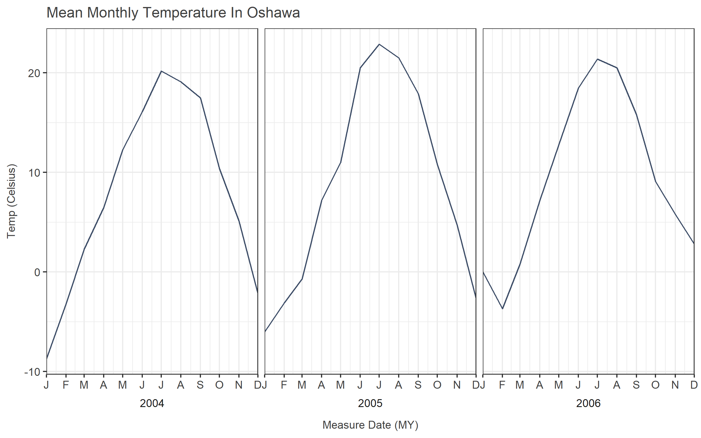
But now the years are discontinuous, and if you want to trend across them, it won’t work, which may or may not matter to you. It matters to me. It’s simple, but it doesn’t seem all that useful.
You could also just annotate the years on the plot… First you make it obvious where the years start by making those axis points a little darker, then add a label beside those lines.
#First we have to pull out the January dates from the data
vlines <- oshawa[oshawa$Month == 1,'ReportDate']

#We'll make darker vertical lines for the beginning of the years, and then put a label to the right of that.
ggplot(oshawa, aes(x=ReportDate, y=MeanTemp)) +
  geom_line(colour = "#3E4E68") +
  geom_vline(data = vlines, aes(xintercept = ReportDate), colour="grey50") +
  geom_text(data = vlines, aes(label = year(ReportDate), x=ReportDate, y=min(oshawa$MeanTemp)), nudge_x = 40, size = 4, colour="grey25") +
  labs(title = "Mean Monthly Temperature In Oshawa",
       y = "Temp (Celsius)",
       x = "Measure Date (MY)") +
  scale_x_date(date_breaks = "1 months", labels = dte_formatter, expand = c(0,0))
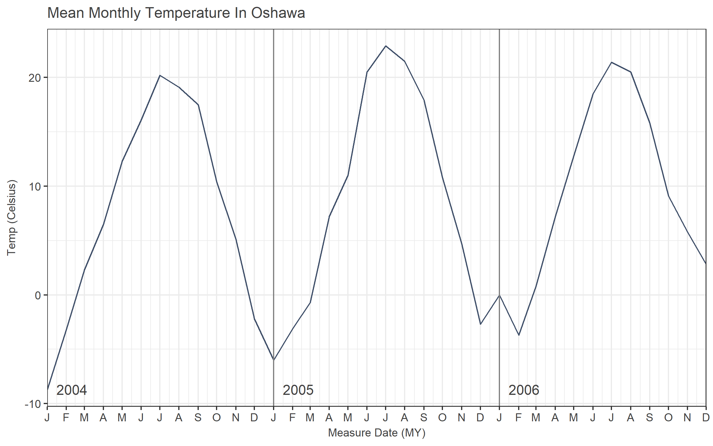
That looks pretty good to me.
If you’re into being more complicated, you can do fancier programming with grids and grobs and such to get different results, including labelling below the axis. Some relevant links:
https://stackoverflow.com/questions/20571306/multi-row-x-axis-labels-in-ggplot-line-chart
For my purpose and audience, the best results would either be the rotated “J04, F04, M04” format, or the plot with the annotated years. I’m leaning towards the latter. This approach meets the criteria of being comprehensible and uncluttered. It also meets the criteria of not taking too much time to generate. Compared to tinkering with grid layouts, using annotation also seems likely to be easier to understand from the perspective of the poor coworker who might need to read my code. There isn’t anything going on but basic ggplot, and a really simple custom format function.